सखा

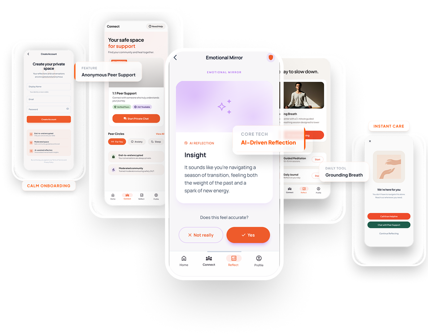
Sakha – A Friend Who Understands You

A mental wellness support system for Gen Z, bridging the gap between clinical therapy and silent suffering.

"Bhai ye baat apne mein hi rehne de..."

Sakha App Interface

The Silent Pandemic

They scroll.
They distract.
They avoid.

"They don’t need more content. They need comfort."

Decoding the Avoidance Loop

Message Avoidance

Overwhelmed by group chats and forced positivity, Gen Z retreats into isolation rather than seeking help.

Emotional Fatigue

Standard clinical apps feel like homework. Filling out mood charts feels exhausting, not relieving.

App Avoidance

Fear of privacy breaches or being labeled "sick" prevents them from keeping wellness apps on their main screen.

पहचान

Indian Gen Z Personas

Designing for a demographic that demands extreme privacy and rejects clinical jargon.

The Overwhelmed Student

Rohan, 20

B.Tech Student • Tier-2 City

Goals

  • Needs a safe, hidden space to vent academically-induced stress.
  • Wants quick grounding tools before presentations.

Frustrations

  • Group chats give him intense FOMO and anxiety.
  • Traditional CBT journaling feels like "extra homework."
The Burned-out Professional

Priya, 23

Junior UI Designer • Bangalore

Goals

  • Wants stealthy mood tracking that doesn't scream "Mental Health App."
  • Craves connection with people experiencing similar corporate fatigue.

Frustrations

  • Afraid of coworkers looking at her phone screen and judging her.
  • Clinical medical apps feel robotic and deeply impersonal.
समझ

Users don’t want therapy.
They want understanding.

Building a Safe Space

सोच

Casual Emotional Support

Conversational tone over clinical diagnoses. Feeling like a friend, not a doctor.

Reduce Thinking

Zero-friction inputs. One-tap mood tracking without paragraph-long explanations.

Quick Relief

Immediate grounding exercises (breathing techniques) accessible in seconds.

Full Control

Absolute privacy. Ghost-mode journaling that disappears if required.

Information Architecture

Information Architecture

Vicious to Virtuous Loop

Stress
Scroll Endlessly
Feel Worse
Avoidance
Open Sakha
Relief & Clarity
नींव

Low-Fidelity Foundations

Before rendering high-fidelity pixels, we mapped the core emotional journeys. Our wireframing phase focused strictly on structural clarity and removing cognitive friction.

Sakha Low Fidelity Wireframes
रूप

The Final Experience

We translated the wireframes into a warm, inviting interface completely devoid of clinical triggers. Every interaction was designed to intuitively feel like a deep breath—calm, secure, and profoundly human.

Sakha High Fidelity Screens Spread
शांत

Empathetic AI Layer

Instead of generating generic wellness tips, the Sakha AI strictly interprets the emotional tone of the user’s check-in to dynamically adjust the UI colors, haptics, and tool suggestions. It listens, adapting the environment silently.

The Impact

  • 65%

    Higher Daily Retention than standard clinical apps.

  • 40s

    Average time to find a relief tool, down from 2 minutes.

  • 9/10

    Users re-assessed their emotional state correctly.

सीख

Key Takeaway

We often design mental health apps to "fix" people. But Gen Z doesn't want to be fixed. They want agencies to manage their own chaos safely.

The UI's primary job isn't to diagnose—it's to hold space.

Let’s design meaningful
experiences together.

Have a project in mind or just want to chat about design?

Connect Now
Back to Home